Why am I writing about Target Plots anyway?
A few weeks ago I attended a meet-up organized by the group Data Visualization NY, called “Visualizing Data in the Life Sciences”.
The first speaker Dr. Scott D. Chasalow, Director & Head of Translational Bioinformatics Methodology at Bristol-Myers Squibb, drew from his experiences in Translational Bioinformatics and gave us examples of visualizations in both his specific field as well as the Pharmaceutical Industry that were either:
1. Too Hot: more common than they deserve to be
2. Too Cold: less common than they deserve to be
3. Just Right: as common as they deserve to be
While the ‘too hot’ and ‘just right’ sections featured the usual suspects of data visualization (Bar charts, Venn diagrams, etc.), it was the ‘too cold’ portion of his talk that piqued my curiosity the most and prompted me to take pictures of his slides to later look up.
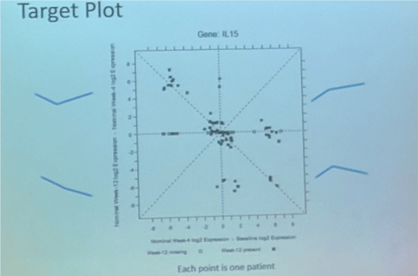
In particular, I was interested in a plot he presented called the ‘Target Plot’. The Target Plot is a very clever twist on a traditional scatterplot that helps classify trends over time.
In the example, Scott presented (sorry for the blurry picture attached below but it’s the best I took), he was trying to assess how various patients responded to a particular treatment, specifically by conducting “gene expression profiling” at 3 different points in time: at baseline, at 4 weeks, and at 12 weeks. He then plotted the results for each patient using a Target Plot, where each dot represents a patient, and the quadrant they fall in indicates how their measurements increased or decreased over time, which is represented by the blue trend lines annotating each quadrant.
If this seems like voodoo right now, don’t worry. I will get to the details of how target plots work in the next section of this post.
I was fascinated by this unconventional representation of time-series data and could see this chart as being transferable to scenarios outside of Life Sciences. But alas, my attempt to find a detailed explanation or example online yielded nothing useful- perhaps partly owing to its generic name.
In the rest of this post I will attempt to capture what I learned about Target Plots during the presentation — both as a way to preserve and share that knowledge, as well as to invite feedback on where others in the data visualization community may have encountered this plot and under what name.
Additionally, in the latter part of this post, I will also discuss a New York Times example that uses a Target Plot to visualize how the stock markets of various countries responded after the financial crisis of 2007–9. Thanks to Scott, again, for presenting this example during his talk.
Target Plot: The General Concept
Target Plots are used to compare changes in a value at three different successive points in time, in the form of a 2 by 2 matrix similar to a scatterplot.
So let’s say the three successive points in time are a, b, and c. The two variables that would be plotted are:
- c-a: Change between initial value and final value (value at time c minus the value at time a)
- b-a: Change between initial value and interim value (which is the value at time b minus the value at time a)
Based on the two variables being plotted we get a grid similar to the one shown below, where the y-axis plots change between the initial and final value, and the x-axis plots change between the initial and interim value. Both of these would yield positive(+ve) and negative(-ve) values.
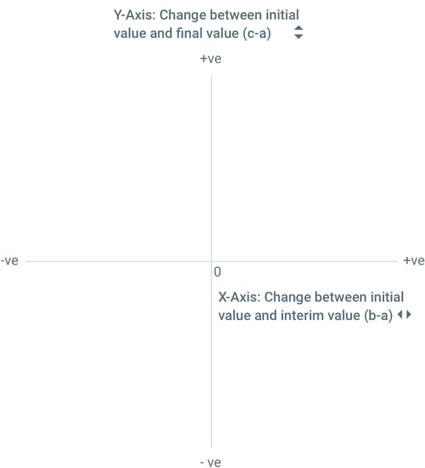
Note that there is no hard and fast rule for which variable goes on which axis, and you could easily flip the X and Y axis. The reason for choosing this setup for this post was to maintain parity with a New York Times example discussed in the latter half of this post.
Hold on, what is the point of this?
The real value of the target plot is in how it can easily segment data points into the following quadrants:
Quadrant 1 (top right)
Both deltas are positive
Any data point that falls here shows an overall increase as well an interim increase
Quadrant 2 (top left)
Final delta is positive
Interim delta is negative
Any data point that falls here shows an overall increase but an interim decrease
Quadrant 3 (bottom left)
Both deltas are negative
Any data point that falls here showed an overall decrease as well an interim decrease
Quadrant 4 (bottom right)
Final delta is negative
Interim delta is positive
Any data point that falls here showed an overall decrease but an interim increase
This can be summarized using the following graphic:
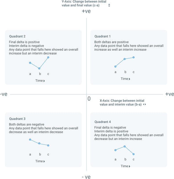
The above results were also annotated by Scott in his slide as we saw earlier in this post.
What more can I learn from Target Plots?
This is not all we can learn from Target Plots… there’s more!
Target plots inherently encode changes from an initial baseline value. But what if we wanted to compare the interim value to the final value to better understand the trajectory of a data point? Simply put, is it possible to order values at all three points?
As it turns out, this is easy to do for Quadrants 2 and 4:
In Quadrant 2, values decrease and then increase above the initial value, which produces an overall increase. In other words,
Interim value < Initial value < Final value, or b<a<c
In Quadrant 4, values increase and then decrease below the initial value, which produces an overall decrease. In other words,
Final value < Initial value < Interim value, or c<a<b
But for Quadrants 1 and 3, this ordering is a little more complicated.
By looking at Quadrants 1 and 3, we can tell if our data point either increased or decreased from the initial value during its interim and final stages. But what we don’t know is how the interim value and the final value compare to each other. For instance, each of the following graphs is possible for a data point in Quadrant 1-

Similarly, for Quadrant 3, we cannot order our interim and final values so easily. Rather, we will have to draw another 45-degree reference line on our plot (x=y line) to make those comparisons.
What can we say about points lying on the reference line?
Any point that lies on the 45-degree reference line will have an interim value that equals the final value:
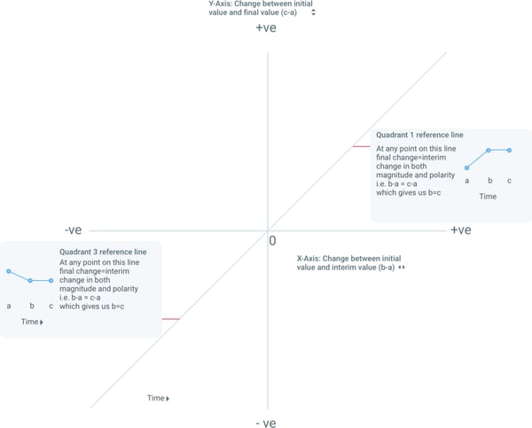
In Quadrant 1, points on the reference line signify that a value increased and then stayed the same, or Initial value < Interim value = Final value (a<b=c, with the overall effect still being an increase).
In Quadrant 3, points on the reference line signify that a value decreased and then stayed the same, or Interim value = Final value < Initial value (b=c<a, with the overall effect still being a decrease).
But what about points not on the reference line?
For points not on the reference line, we can break it down by looking above and below the reference line within each quadrant:
For Quadrant 1:
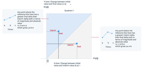
For Quadrant 3:
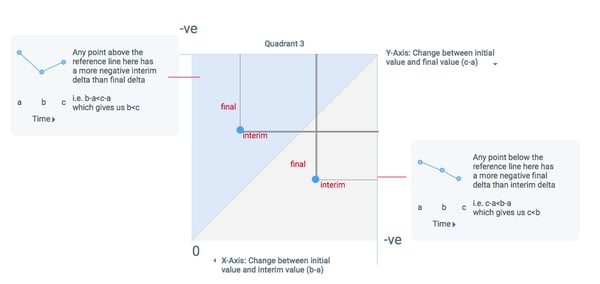
Cool, so how do I apply this?
The following graphic (you can read the full story at this link) from the New York Times uses a Target Plot to show how the stock markets of different countries reacted during the financial crisis of 2007–9. The graphic looks at MSCI measurements for 30 countries at 3 different points in time (listed below) to see how they recovered —
- World market peak in 2007(October 31, 2007)
- World market bottom in 2009(March 9, 2009)
- Around the time the article was published in 2012(August 21, 2012)
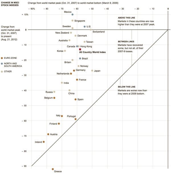
This graphic follows a similar framework to our target plot, where the initial point of time (a) is world market peak in 2007, the interim point (b) is world market bottom in 2009, and the final point (c) is in 2012 when the article was written. Similar to the other examples detailed in this post, the y-axis plots change between 2007 and 2012, while the x-axis plots change between 2007 and 2009.
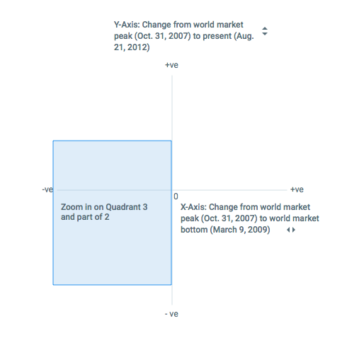
Another thing to note is that the NYT plot zooms in on Quadrant 3 and Quadrant 2 of the classic Target Plot, since the story that’s being told is about how most countries showed a decrease in both 2009 and 2012 (thus appearing in Quadrant 3), while only 4 countries- United States, Mexico, Singapore, and Sweden- were able to recover from their 2009 dip and could show an overall increase in 2012.
Similar to our example, the 45-degree reference line shows two regions-
- Above the reference line are countries that were able to recover some of their losses
- Below the reference line are countries that fell consistently and were worse off in 2012 than in 2009.
Wrapping up
To wrap-up, I wrote this post as much to understand and learn about Target Plots as I did to explain them.
When discussing this example during one of Axis Group’s design team meetings we realized how this idea could be extended beyond just showing changes over time. E.g. it could be used to measure performance against two benchmarks say store sales vs. national average vs. regional average. A reader of this post pointed to one such example here.
If you spot any inconsistencies in this article or think I could have explained something better or have any other questions please do leave me a comment.
If you have worked with a plot like this, be it by any other name, I’d love to see an example :)
Thank you and I hope this helps!
Also to the curious, the title is indeed a reference to a quote from Shakespeare — “What’s in a name? That which we call a rose By any other word would smell as sweet”
The Contributors:
 Manasvi has a Master’s degree in Human-Computer Interaction from Georgia Tech with a background in Interactive Computing. Manasvi's design philosophy is rooted in research and rapid prototyping. “Fail early and fail often” is her motto. Manasvi enjoys discovering and sharing new articles and podcasts on design, as well cute animal GIFs for when you need a pick-me-up.
