Overview
Two weeks before its Qonnections 2017 worldwide user conference, Qlik kicked off its Hack Challenge, where teams were invited to develop and present Qlik-based solutions to assist the UN’s MONUSCO peacekeeping force to analyze the twenty-year conflict in the Democratic Republic of the Congo.
The conflict in the DRC has claimed nearly 6 million lives from violence, disease and malnutrition and has displaced millions more from their homes. There are numerous causes of instability: Struggle for political control, ethnic tensions and historical mistrust, and access to and exploitation of the country’s rich resources. Yet even with UN oversight, death and lawlessness still prevails in the DRC.
Our Team Haxis was honored to win first place in the competition, which we presented on May 16, 2017 to a panel of judges from the United Nations and Qlik and the esteemed visualization luminaries Randy Olson and Alberto Cairo. We were particularly gratified to win given the high quality of entries from the other teams.
Objective
From the start, the team believed that the Hack Challenge was as much an opportunity to help tell the story of violence in the DRC as it was a chance to help the UN analyze the conflict. Thus we set out to create an interactive experience where users can explore the players and patterns and learn about the factors that influence the conflict.
Data
ACLED
The primary data source for the Hack Challenge came from ACLED, the Armed Conflict Location & Event Data Project, which supports research and work devoted to understanding, predicting and reducing levels of political violence. ACLED is a unique resource that collects, aggregates and makes public data on political violence and protest data for developing states. ACLED contributors have documented data points for over 200,000 individual events since 1997 (and nearly 11,000 for the DRC), including:
- Dates and locations (latitude/longitude and administrative region) of conflict events;
- Specific types of events including battles, civilian killings, riots, protests and recruitment activities;
- Events by a range of actors, including rebels, governments, militias, armed groups, protesters and civilians;
- Changes in territorial control; and
- Reported fatalities.
Conflict mining data
Shortly after the Hack Challenge began we learned that IPIS Research, an independent Belgian research institute, had just open sourced line-level data it collected on more than 2,500 mines in DRC, including their location, type of mine, the number of workers and whether armed guards were present.
Given that much of the violence in DRC stems from battles for control over the country’s natural resources, including gold, diamonds and minerals, our team decided to integrate the mining data and assess whether it would reveal any new patterns.
Approach
To create a cohesive experience of data analysis and storytelling, Axis assembled a multi-disciplinary team of designers, developers and data scientists. After a few days of initial analysis of the ACLED and mining data, the team mocked up numerous wireframes, assessed which ones were best supported by the data for effective analysis and storytelling, and ultimately decided to present three views of the conflict.
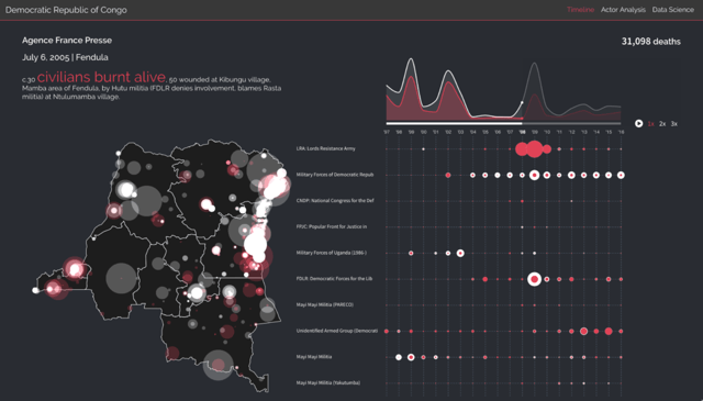
The first screen plays a twenty-year timeline and animates several charts: Highlighting selected events with text, pinpointing the events on a map, charting the ebb and flow of various actors over time and calling out the civilian death toll. Users can speed up the animation and explore the map or the various actors.

The top of the second screen was designed to let a user analyze different actors in the conflict and the neighboring countries where they have operated outside the DRC, particularly countries on its eastern border which is the locus for much of the violence. The team presented a chart showing fatalities and countries by actor and accompanied it with a choropleth map colored by number of fatalities. Users can also search the QIX engine and filter by actor, actor type, event type or country, and the app instantly updates the fatality table and map.
The bottom of the second screen presents an interactive network diagram that allows users to explore the evolution of alliances and enmities among the various actors over the twenty-year period. To help avoid the clutter that often turns network diagrams into unusable “hairballs”, we decided to pin nodes of different types – Government, Rebels, Militias – to certain areas of the screen. Users can also click the actors to filter and progressively navigate their web of alliances and enemies over time.
Finally, the third screen presented the results of our team’s data scientists. The team created over 100 features and ran them through a random forest model to assess which features were more likely to predict fatal conflicts. The designers created a dendogram that presented a pruned set of features to help the user trace whether a hypothetical conflict was likely to result in fatalities. The team presented a more complete set of predictive features in a chart below the tree. Some of the features with higher relative predictive value included an actor’s historical propensity for violence, an actor’s geographic spread of activity, and the proximity of a conflict to a mine.
Process and architecture
Given the short timeline, it was important to select an architectural framework that would allow rapid development and good performance. Of course we used Qlik for the data layer and relied on its associative model and super-fast calculation engine. However, because the Qlik UI could not do everything we planned, we blended it with a front-end built using several other web components: Angular.js, Mapbox.js, Uber’s Deck.gl and the indispensable d3.js.
Next steps
We are proud to be part of Qlik’s commitment to corporate citizenship and look forward to working closely with the UN in the coming weeks to identify more ways to help analyze the conflict in the DRC.
While Qlik also awarded Axis as 2017’s Solution Provider of the Year for the Americas, our Hack Challenge win was perhaps a little more personal and satisfying.