The QlikView and Qlik Sense platforms offer an amazing ability to interactively filter through dynamic data sets. However, the visualizations that sit on top of these data sets have in the past been mostly static.
Qlik Sense has introduced new functionality for interacting with visualizations beyond just filtering the data. Techniques like brushing, panning, and zooming are included that expand upon the data discovery process of QlikView 11. This is a new way to think about data discovery: users can interact with the visualizations themselves, not just the underlying data.
Thanks to the new user-friendly APIs, we can extend interactivity in Qlik Sense even further by building custom visualizations with powerful libraries like D3. These custom charts can improve the user experience and information design through elements like annotation, linking, and instant feedback loops.
I've built an example mashup that demonstrates some ideas for interactivity that I've seen used in data visualizations outside of QlikView. The source code and deployment instructions are posted on GitHub. For those not using Qlik Sense yet, you can view a sample of the visualization without the Qlik integration here.
Chart Overview
The data set I've used for illustration is sales data. The data set includes two metrics: # of sales, and the average discount rate given per sale. The metrics are reported by sales office, which rolls up to region. There is also a Sales Type field to demonstrate Qlik Sense filtering.
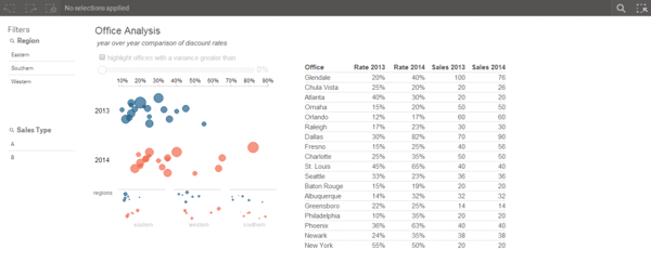
The goal of the visualization is to understand how discount rates have changed year over year across offices.
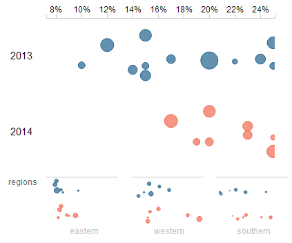
The chart used is a strip plot, paired with a table. A strip plot is similar to a scatter plot, but only plots points over one metric. It is useful for viewing the distribution of items across a measure, as well as finding outliers. The strip plot above encodes information across the x-axis. Because there is no coding for the y-axis, besides the grouping by year, the points on the plot are randomly jittered so that it is easier to differentiate clusters of points.
In this example, I have plotted every office's average discount rate across 2 years. The size of the points are encoded based on the number of sales. With a brief scan, we can see that the distribution for 2014 is much wider than it was for 2013, thanks to several offices that have moved past the prior year's max discount rate.
Brushing with Small Multiples
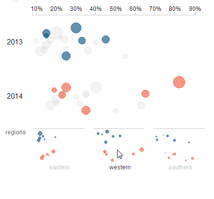
Small multiples sit at the bottom of the chart, separating the data set into regions. These small multiples can be hovered over to brush the main graph.
Brushing provides the ability to apply new context to the visualization by letting users analyze subsets. Small multiples provide guidance on what subsets should be looked at by providing a quick glance at their distributions. For example, it is clear from the small multiple that the Western region is partially responsible for the skewing of the distribution to the right.
Parametrization
A common request in QlikView dashboards is to include parameters that can be changed to affect the chart. Typically, these are thresholds for metrics that don't have a standard definition, so users want to manipulate the variable themselves as they analyze the data.
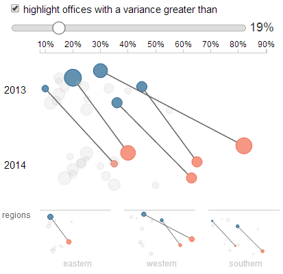
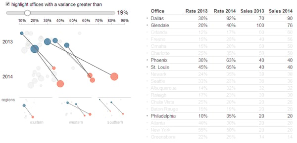
This mashup can highlight nodes based on the variance of the discount rate year over year. Rather than hard-code the threshold for this highlighting, it is created as a parameter that the user can manipulate with a slider.
The parameter is separated from the Qlik data model, so the chart instantly updates as the parameter is changed. This creates an instant feedback loop for the user, which is vital for creative data discovery. Rather than hard-coding a threshold, the user can use this parameter to fine tune the context they are interested in.
Linking
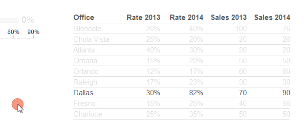
Mashups and extensions allow us to link charts together, which can improve the usability of an interface. For example, the table in this mashup is linked to the brushing of the strip plot.
Annotations
Extensions give developers full control over detailed annotations of data graphics. These annotations can be used to provide additional levels of macro and micro details that enhance the information in some way.
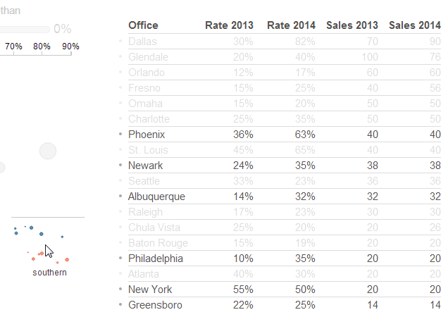
In the mashup, dots have been included next to table rows when brushing sets of nodes.
In this screenshot, the dots show the location in the table of the Southern offices that are brushed. I previously had clicked on the "Sales 2014" column to sort it descending. With this combination of sorting and brushing, the dots by the table rows act as a dot plot that visualizes the rankings of the Southern offices by 2014 sales. This annotation provides an additional level of information: the Southern offices are skewed towards the bottom of the sales rankings.
Here is an additional example using the variance parameter.
Missed Opportunities
There are several ways this visualization could continue to be improved. Here are a few quick ideas:
- Annotation: there is no legend for the node size. Oops.
- Annotation: an additional level of macro details could be shown by adding symbols for the medians of the strip plots. This could be extended further with other elements like the interquartile range, outlier highlighting, etc.
- Context and Feedback: the chart includes the ability to pan and zoom within the strip plot area by clicking and dragging or scrolling with a scroll wheel
However, the small multiples do not respond to the zooming and panning. These plots could zoom and pan in the same way as the main graph. Or, they could visualize the context of the pan and zoom with shading of the small multiple area. The small multiples would then provide feedback about the location that the user has zoomed into.
Sources
A lot of the ideas explained here are taken from visualizations around the web. Two sources in particular stand out.
Bret Victor's "Up and Down the Ladder of Abstraction" is a great essay about interactive design and touches on the importance of instant feedback loops.
Luis Carli's "Wood Changes" demonstrates small multiples as brushing legends in a series of great visualizations.
-Speros

